PROJECT DURATION FEBRUARY TO APRIL 2023
PROJECT DURATION FEBRUARY TO APRIL 2023
MY ROLE
UX designer, designing an app for the Art Gallery, from conception to delivery.
RESPONSABILITIES
Conducting interviews, paper and digital wireframing, low and high-fidelity prototyping, conducting usability studies, accounting for accessibility, and iterating on designs.
THE PROBLEM
Busy professionals or business persons have limited time to attend to the art gallery.
THE GOAL
Design an app for the Art Gallery that allows users to take a virtual tour in advance and schedule visits.

I conducted interviews and created empathy maps to understand the users I’m designing for and their needs. A primary user group identified through research was professionals with busy schedules.
Nevertheless, the research revealed that time availability was not the only user's problem. Other problem included was not having enough information about the artwork or artists.
TIME
Working professionals are too busy and need to plan and schedule visits to the art gallery.
INFORMATION
Art enthusiasts need to get the desired information about the artwork and artists.
ACCESSIBILITY
Art gallery websites don’t offer translated content or Text to Speech feature.
EXPERIENCE
Art enthusiasts want to have an immersive art experience from home or in their free time.
“Getting out to concerts or exhibitions really helps me disconnect from my busy routine.”
AGE 44 | EDUCATION Master’s Degree
Hometown Buenos Aires | Family: Married, 2 kids
GOALS
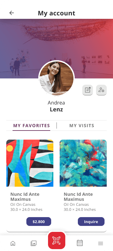
• Easily buy art pieces for her own art collection.
• Get better and more information about art pieces and artists.
• Plan and schedule art gallery visits.
• Be able to visit the exhibitions online.
FRUSTRATIONS
• Visiting the whole exhibition takes too much time.
• Doesn’t get the enough information about artists and art pieces while visiting an exhibition.
• The times of the guided visits do not fit a busy schedule.
• Buying art pieces or art related products takes time.
Andrea is a 44-year-old professional project manager who lives with her husband and two children. She has a busy schedule, but tries to make time to go out and attend to cultural events, such as going to the theatre, art exhibitions or concerts. For her, art is a way to disconnect from her routine and de-stress.
She loves art and likes collecting art pieces for her home. She thinks each one of them tells a valuable story. In fact, she likes telling those stories to her friends and family when they visit her.
Andrea feels she doesn’t have time enough to visit art galleries as much as she would like. Sometimes she misses events and exhibitions that she would have loved to attend. She would like to find a way to know more about artists and exhibitions, as well as buying art pieces easily.
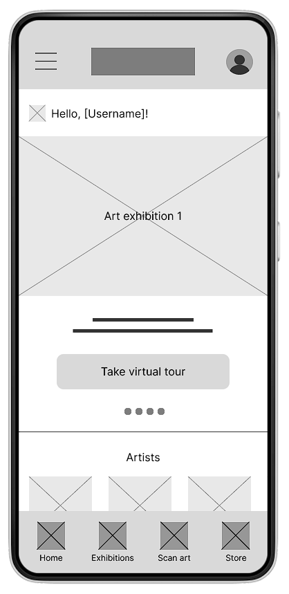
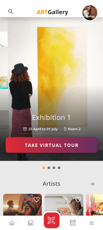
I created paper wireframes to quickly draft iterations of each screen of the app. The aim was to make sure that the elements would be well-suited to address user pain points. For the home screen, I prioritized the exhibitions showcase, so that the users could easily access to the app’s main feature: the virtual tour.
As the initial design phase continued, I made sure to base screen designs on feedback and findings from the user research.
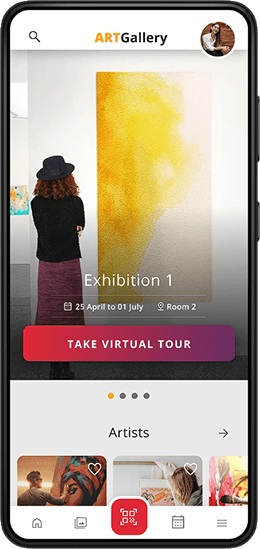
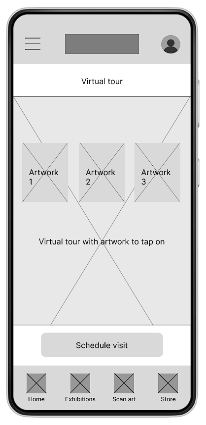
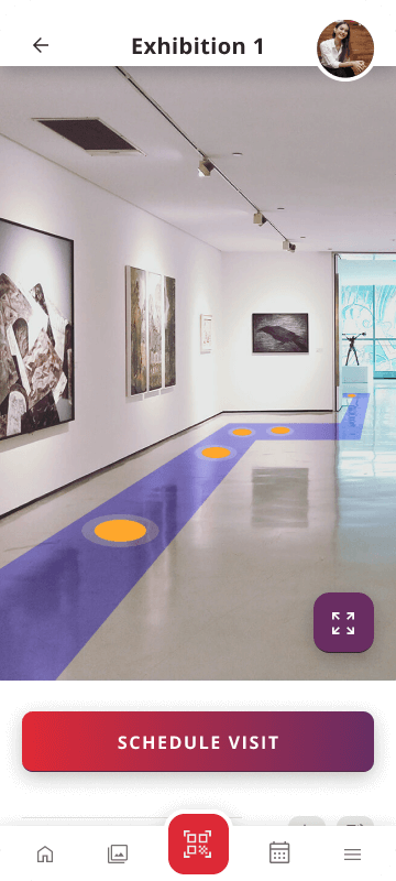
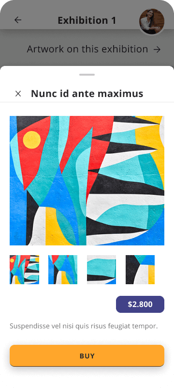
The virtual tour in a large size provides an immersive experience, which is one of the goals of the app. Also the main features are placed in a bottom navigation bar so that the user can find them easily.
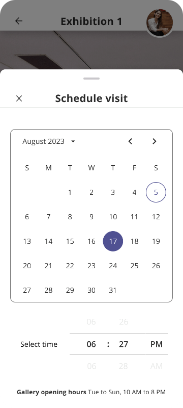
The low-fidelity prototype shows the primary user flow of scheduling a visit to the art gallery, so it could be used in a usability study with users.
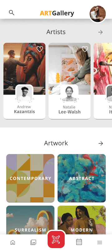
Art exhibitions slider with the featured exhibitions
Take virtual tour button in a visible position
Virtual Tour feature
Bottom navigation bar
✔ Users want to schedule an art visit easily.
✔ Users want more information about the art exhibitions.
✔ Users want to access to the artwork information quickly and easily.
✔ The schedule visit process takes too long.
✔ Users want a quicker way to access to the artwork information.
After the usability studies made on the lo-fi prototype, I adjusted the screen layouts and the navigation for a better user experience. I also revised the hierarchy and proportions of the elements, so users can see the main functions when they first land on each screen.
I made changes to the scheduling process. The steps were simplified so that the selection of date and time can be done in the same screen.

All color contrasts were checked, to ensure an accessible contrast ratio.
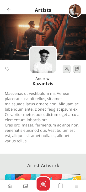
Translate and Text to Speech features were added.
Used icons to help make navigation easier.
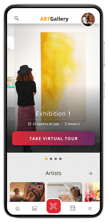
The art gallery app accomplishes the goal of offering an immersive art experience, with a clear user flow and useful features.
One quote from user feedback: “It looks very clean and it is easy to understand. I’d love to see more!”
Conduct another round of usability studies to validate whether the pain points users experienced have been effectively addressed.
Conduct more user research to determine any new areas of need.